As a new social club for home cooks, we worked to solidify Potluck Club's branding through product design.
Role
Product Designer
Team
1 Product Manager 1 Product Designer
Timeline
3 months
Skills
Customer Insights, Branding, Product Design
Problem
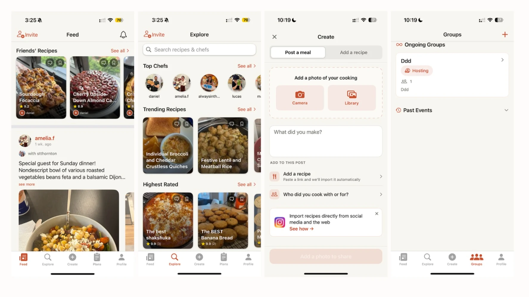
Potluck Club had no clear brand image and a clunky user interface. We also needed to clearly identify target markets and their pain points.
Goal
The goal of this project was to revitalize Potluck Club through small enhancements in its interactive design and social features. These decisions should be backed up by user research and A/B testing.
Research
User personas
Hailey
27 Urban Professional Oxford, UK
Hailey is tech-savvy and often uses apps to organize her life. She loves community and uses meals to recharge and reconnect. Because she's busy she doesn't have the time to always cook for herself. Her space is on the smaller side as she lives in the city.
Goals
Build community easily
Try hosting
Find new recipes
Pain points
Hard to use the AI mode to create recipes
Interface feels awkward
Groups page doesn't encourage community
Dylan
21 New Graduate Brooklyn, New York
Dylan often eats out with friends on weekends but is looking for new ways to be social while saving money. They're a new graduate that lives with their roommates in a small flat but is looking for more friends. They easily adopt new technology but expect a seamless transition.
Goals
Save money
Prioritize cost-efficient cooking
Have low-stakes hangouts
Frustrations
Hard to stay accountable with Potluck page
Explore page is not very interactive
Doesn't know how to cook without steps
Alfonso
35 Stay-at-home Dad Miami, Florida
Alfonso has his hands full with both his small online business and his kids. He's active in his community run club and book club. He loves to cook in his free time and wants to start community dinners with his neighborhood and family.
Goals
Teach his kids how to cook
Make healthy meals for his family
Foster community with his neighborhood
Frustrations
Can't keep track of meals for his family
Needs help with grocery lists
Hard to coordinate with his community on potlucks
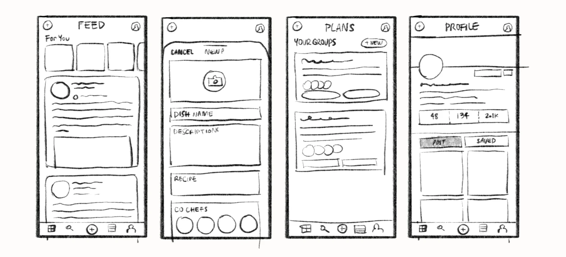
Low fidelity designs
When brainstorming these designs, I looked at Beli, Fable, and Flo to get a sense of social communities and their trackers. I liked how Beli pushed for interaction through a ranking algorithm and personalized lists.
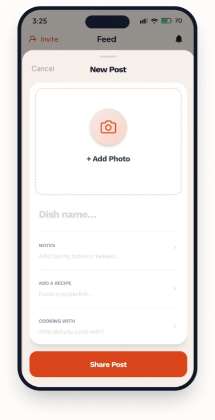
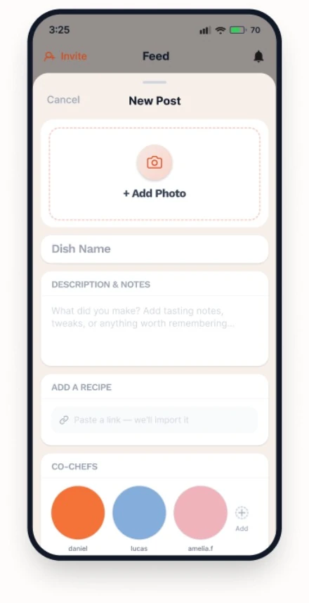
A/B testing the new post flow
Should we condense it into one screen? Or make it more interactive through a scroll feature and profile pictures?
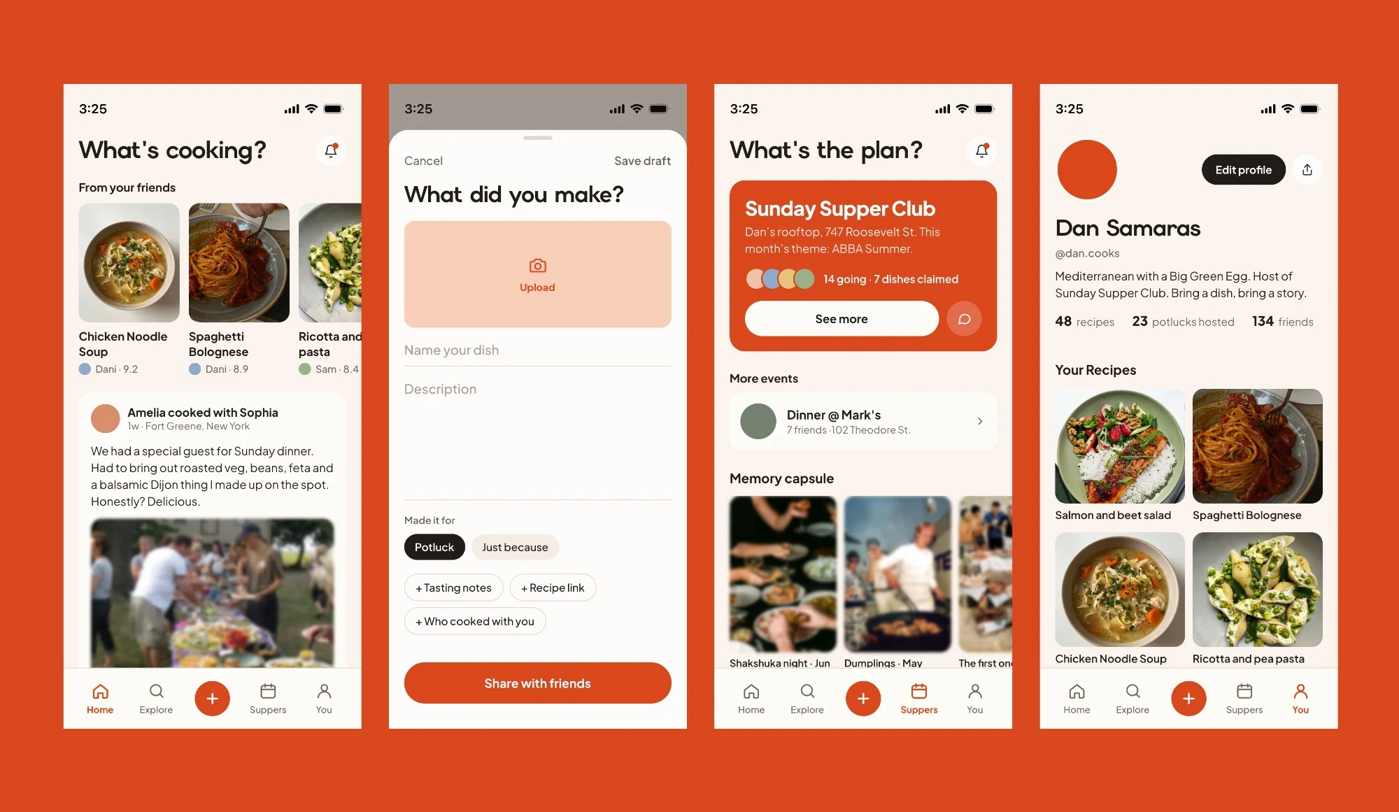
Final prototype
Serif font with bright orange → keeps it warm and nostalgic.
Suppers feature memory capsule and show upcoming plans → highlights the social aspect while acting as a keepsake.
New post slides up from the bottom → keeps the flow from being interrupted, intuitive.
Reflection
Through this redesign, I got a better grasp of implementing social features into products. I particularly like the Plans tab and how you can see past Potlucks as a memory carousel. If I could do it again I would want to play around with the font scheme and logo (and possibly include a mascot) to fully shape the Potluck Club brand.