Brown Daily Herald App
A product redesign exploring how PayPal can optimize its user mobile experience while emphasizing usability, functionality, and visual clarity.
TIMELINE
Jan - Now 2026
ROLE
Product Designer
Team
1 Product Manager
5 Product Designers
skills
User Research Competitive Analysis Prototyping Design Systems

PayPal’s prioritization of promotional content impedes core feature functionality.
the problem
Company
Background
Strengths
Weaknesses
Zelle
Integrated directly into U.S. banking apps
Cashapp
Offers peer-to-peer payment service
Venmo
Owned by PayPal
No additional revenue streams +
less brand image
Minimalist design limits discovery of secondary features
Public feeds create privacy risks. No international payments.
Full integration means less barriers to adoption
Immediate clarity on core features
(3 nav tabs)
Socially geared towards peer-to-peer transactions
Competitive analysis
User research
Investigating points of friction in the PayPal user experience.
I interviewed three types of users: the standard user who mainly uses PayPal to send and receive money, business owners, and overseas workers. The questions I asked were:
What are the top three features you look for when opening a payment app?
What pain points do you most often face with payment apps?
What features would you want to see in a payment app?
What is your favorite payment app? Why?
The core factors that influence payment platform use are: ease of use, transaction fees, security.
Users would like digital wallet integration, financial tracking features and a responsive, intuitive mobile interface.
People find it tedious to go through multiple layers of verification/authorization to manage subscriptions and initiate payment.
Key Insights
Prioritize a consistent design system, clear user control, and security indicators like biometric scanning.
In order to best understand where in the app I could add/remove features, I created a user flow and information architecture graph for clarity. The blue boxes in the information architecture highlight repeated visual cards, and I knew these were areas I wanted to improve on through intentional placement.


The high-fidelity wireframes I created below felt simple but also unconnected to PayPal's mission and overall purpose as a payment platform.

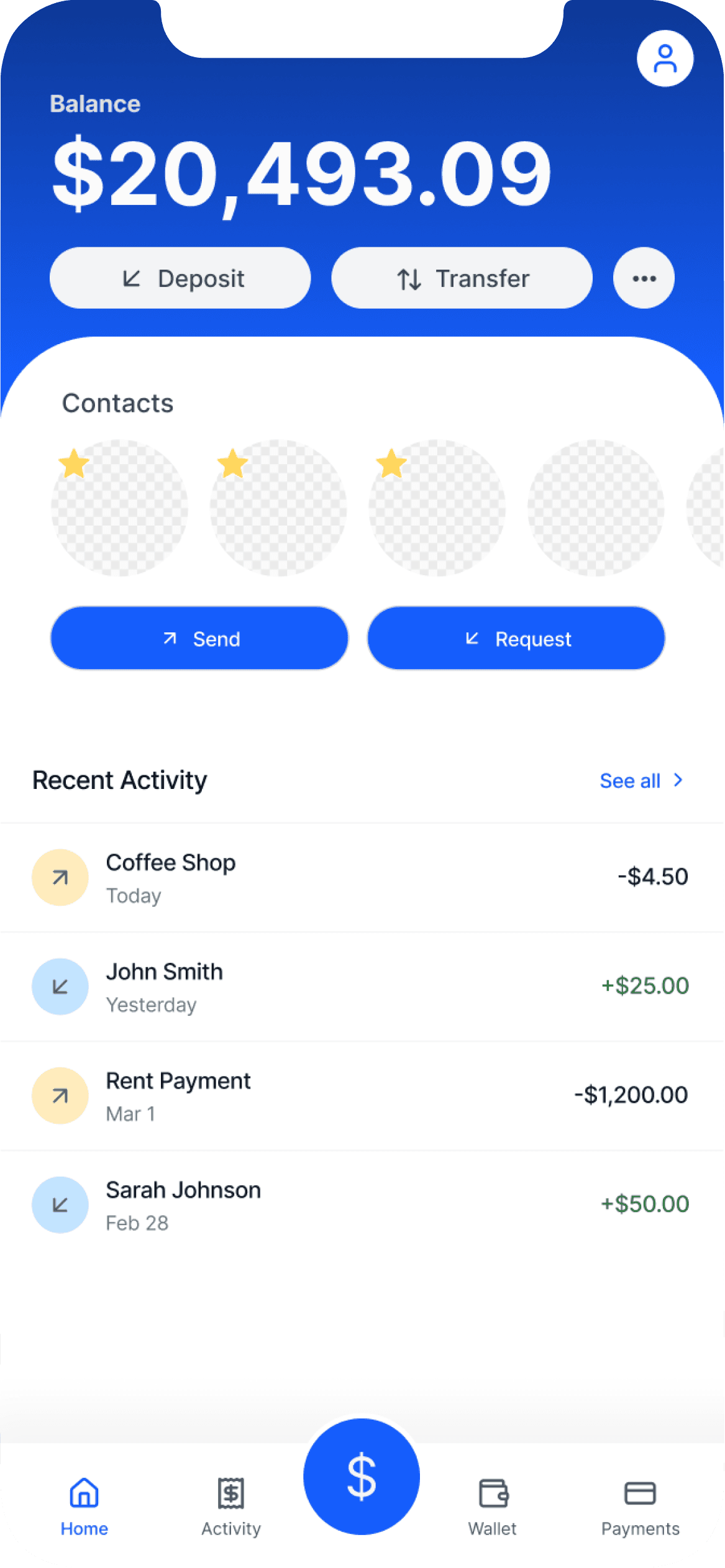
In my next iteration, I emphasized the 'wallet' aspect through separate scrolling sections which allow the user more control over their journey as they are able to choose when they want to see promotions and offers.
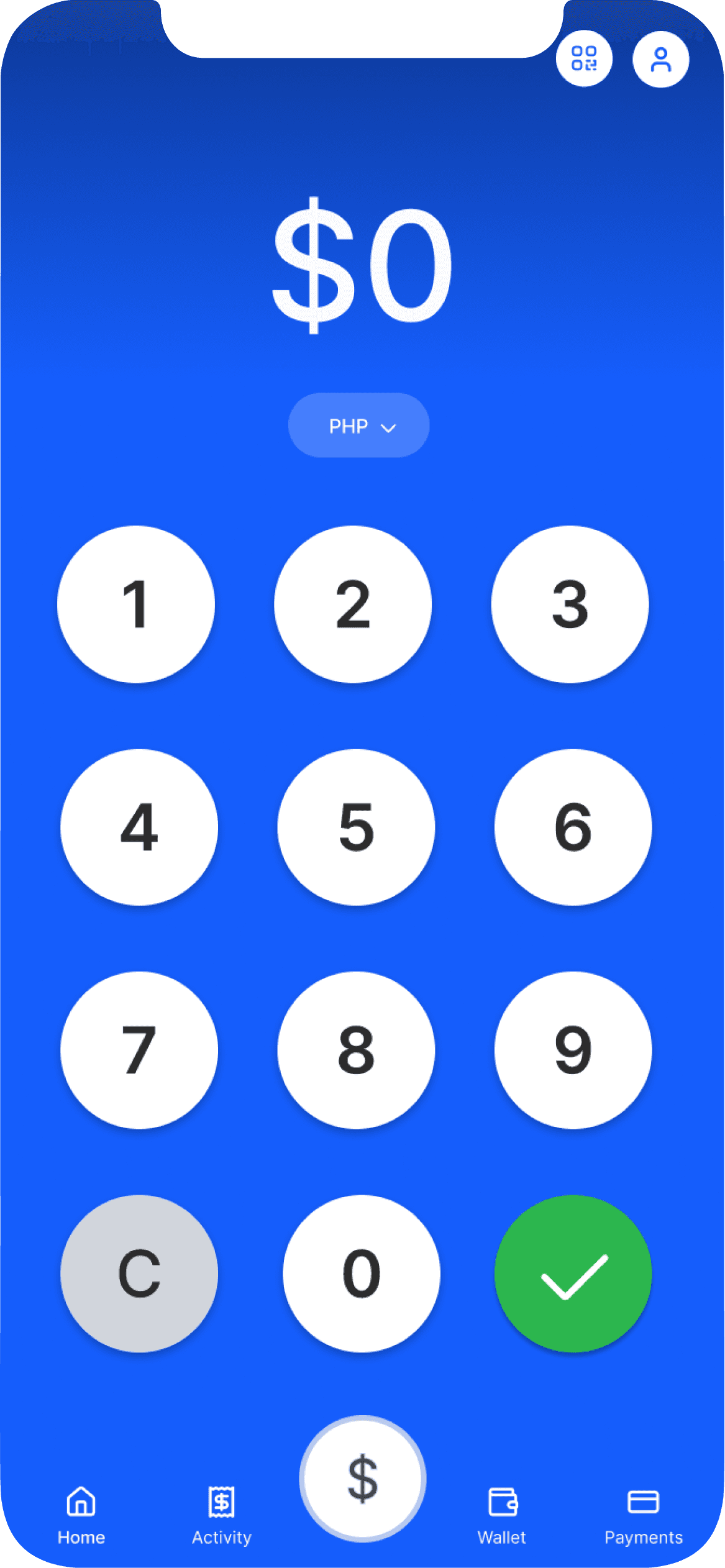
The 'send' frame was inspired by CashApp's simplified and intuitive screen. I wanted to emphasize the core function through the blue background that matches PayPal's branding. I also wanted to simplify the information hierarchy and solely focus on the amount, with the recipient and verification screens coming before/after.
Final product