Paypal App Redesign
A product redesign exploring how PayPal can optimize its user mobile experience while emphasizing usability, functionality, and visual clarity.

Project Overview
Timeline: February - March 2026
Skills: Product Design, Frontend Design, User Research
Overview:
PayPal has aggressively expanded its revenue streams beyond payments, pushing proprietary debit/credit card products, cryptocurrency access, Pay Later financing, and sponsored commerce offers throughout the app. These embedded promotions increase friction in the user journey while contributing to banner blindness and fatigue. Paypal has the opportunity to redesign its information architecture to become the dominant payment platform in the US market.
Research:
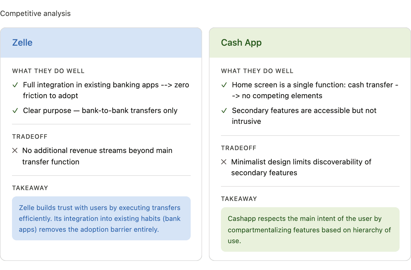
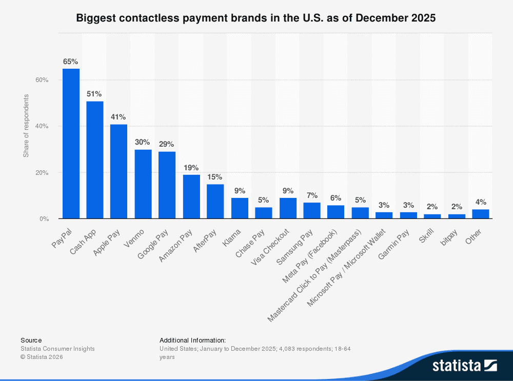
As seen above, it can be assumed that Cashapp and Paypal are the two most dominant contactless payment platforms in the U.S. as of 2025. Cashapp has grown into the niche of providing fast, casual peer-to-peer payments in addition to crypto/stock investing and a free debit card. Paypal on the other hand excels in global reach while offering businesses higher transaction limits and secure checkouts.
Paypal has the opportunity to increase its market share by digging into Cashapp's niche as a platform offering quick P2P payments. However in order to do so, it must address its interface issues.
Problem Statement:
The average user struggles to complete basic tasks on Paypal (sending and receiving money) due to the prioritization of feature discovery over functionality. This creates information overload and adds friction to the user experience.
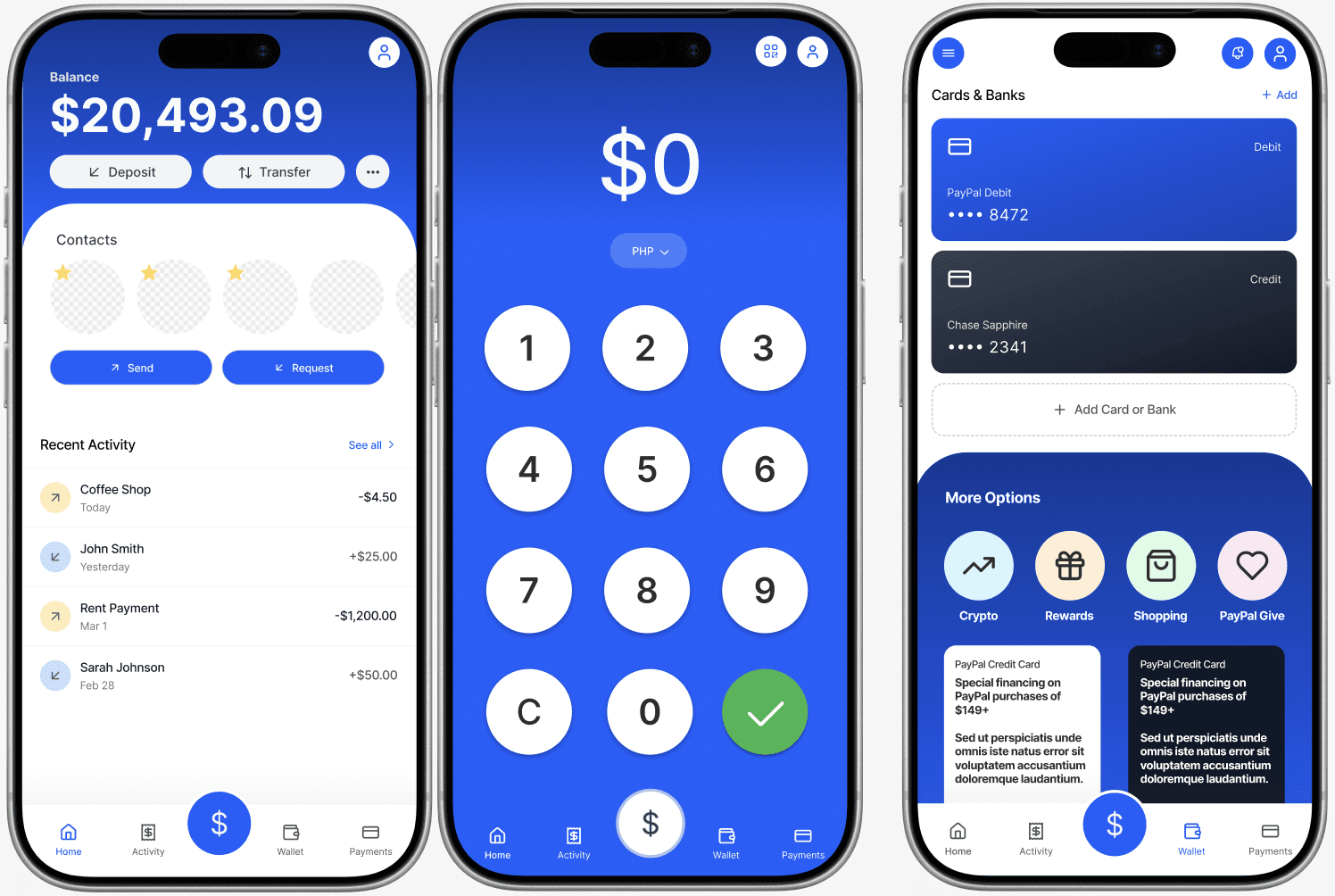
Solution:
Lead with the main action. Lead with a prominent Send / Request button.
Consolidate the navigation Simplify navigation bar to: Home, Payments, Wallet, and Activity. Features can move to the Wallet tab to decrease competition for attention on the home screen.
Progressive disclosure for secondary features Move features to the Wallet tab to make the journey more contextual.
Reduce visual noise Emphasize one primary action through information hierarchy. Move promotional banners out of the primary view entirely.
Tradeoffs:
Simplifying the main function of transfer pay comes at the expense of feature visibility. PayPal's revenue depends partly on cross-selling these products, so lowering their visual priority on the home screen can potentially decrease revenue. However, confusion and disorientation can lead to churned users and Cashapp has captured a significant portion of the online payment market due to its simpler experience.
Reflection:
Every feature on PayPal's home screen exists because it has a function that is valuable to some user. The challenge I faced was deciding what to cut and how to defend the loss of features that brought in revenue. This case study pushed me to think my design principles and how minimalism can benefit business models.